UI, UX, Website Design
Redesigning a Locations Details Page | Spacious Technologies
Project Overview
Spacious Technologies was a network of drop-in workspaces that utilized under-utilized spaces such as restaurants that are closed during the day or buildings that have been sitting empty while they await new owners.
Like most startups, there were a lot of inconsistencies in design styles from the site, to the desktop product, and to the mobile app.
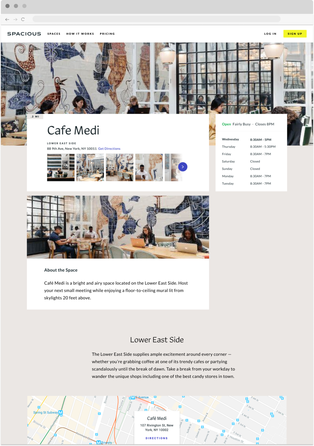
As a junior designer, I was tasked to redesign the existing page to match the new styling associated with updates to the mobile app.
This required the analysis of existing performance of the page, design development iterative wireframing, user testing, icon design, prioritizing features, use case breakdown, breakpoints- from mobile-desktop, and collaboration with the dev team for delivery.

The Problem
Analyzing the existing designs, there were a number of improvements to be made beyond a visual design refresh. There were over 30 places, each with different opening hours and days, and other unique features not shared with the members, hampering their experience.
After speaking to stakeholders, users and auditing the original design; 5 major updates needed to be made based on the friction points below.
Before RedesignUpdate I: Displaying amenities of a location
Each space held different amenities and users wanted to know if a space close to them had certain ones.
Printing for example was only available at specific dedicated locations.
Update II: Updates the image carousel
A large selling point of the service was providing an atmospheric environment to work out of. It was hard to see all images of the locations in the original design.
Update III: Displaying Service Change Information
Service changes were at the whim of the hosting restaurant, so there were many times a regular member to a location would lose access for the day.
Update IV: Displaying Current Occupancy
There was nothing worse than going to a location, and not finding a seat. It was a real painpoint for our busier locations and habitual members.
Update V : Minor nice to haves for marketing/SEO

Adding breadcrumbs, testimonials, and partnership sections for marketing and SEO improvements.
The Process
After requirements were established, I began wire framing layouts and a final design was approved/ tested for usability.
As a part of the visual design updates, I also needed to create additional icons to the custom set fromour branding agency Red Antler.
The Outcomes & Learnings
As final designs were made, the engineering team went through a leadership shift. It was determined scope was too large, and so I was tasked to break the design implements into 8 stages of deployment, after prioritizing impact.
This was my first task as a junior UX designer, and I learned a lot, including how to work with engineers, how to communicate with stakeholders, how to design fro breakpoints and to loop engineering in earlier.


